 As promised, I am posting the final results of our National Popcorn Day Popcorn Popoff Extravaganza!!
Though, I would not have realized it until we did this taste test, it turns out that Jiffy Pop store bought popcorn is quite lousy when held up against the gourmet stuff distributed by Wisconsin Gold. We popped up 8 varieties and measured volume and scored taste a 1, 2, 3 for good, ok and bad! The kids had the best time and we got to have a first hand look at developing a fair test aka: an experiment using the scientific method.
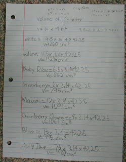
When we last left off, E9 was tasked with calculating the volume of a cylinder. Why? Well because we measured the volume of our different types of popcorn in a pitcher. And what better way to accurately determine the volume of the popped corn than to calculate the volume of the cylinder which the popped corn filled?!
Once he understood where the numbers of his equation were coming from and he had worked some of the math by hand, we showed E9 the wonders of the hand held calculator. He worked out the problems (see evidence above) and wrote down his answers to be used in further analysis.
Once he understood where the numbers of his equation were coming from and he had worked some of the math by hand, we showed E9 the wonders of the hand held calculator. He worked out the problems (see evidence above) and wrote down his answers to be used in further analysis.

Here are the graphs as done by using an open source graphing software. E9 can make lots of different types of graphs and Dan figured it would be ok for him to learn how to use an Excel type software program to assist them in making the final graphs. E9 jumped at the chance for a new learning opportunity. Oddly enough, just that morning he was fervently lamenting the construction of a simple pictograph. And I quote, "This is going to be a lot of work. Do I have to do it?" Seriously? (Grandma- if you are reading, does this sound like anyone you know??)

One of the things we pondered was whether the size of the unpopped kernel would have any effect on the final volume of the popped corn. By making this graph we were able to practice another step in the scientific process- data analysis. Can we use the raw data we collected and answer any more questions? This graph took some tweaking because we used more of a qualitative approach to the data when it came to kernel size vs the quantitative calculation of volume. Another lesson for the kids- which graph best represents our data? Not all graphs are for all types of data. This information is best served by the all time favorite- bar graph! Kernel sizes were classified as small, medium, or large- extremely precise- absolutely!
So, you tell me...as our unpopped kernel size increased, what happened to the popped volume of corn? Is there a trend?


No comments:
Post a Comment